On most Shopify stores, the sold-out badge is a small label on a product card or product image, and it is often the only thing telling a shopper that an item is unavailable. Its text, color and position look like cosmetic choices, but they decide whether a visitor understands the situation or clicks through to a dead end. If you want to customize the sold-out badge your theme shows, the changes are usually quick, and they pay off on every sold-out product at once. The steps below reflect how Shopify's theme editor works at the time of writing. Themes differ, so check your theme's documentation and Shopify's current help pages.
Where the Badge Settings Live
In most modern themes, the badge is controlled in the theme editor, in the settings for product cards or the badges section. You may find options to turn the sold-out badge on or off, choose its shape and pick its colors. The text itself is often not in those settings, because it is a translatable string. Shopify's theme tools let you edit the default content of a theme, which includes labels like "Sold out", in the language settings for that theme. If you cannot find the text in the editor, look there, or ask your theme's support. Make changes on a duplicate theme first so you can compare before publishing.
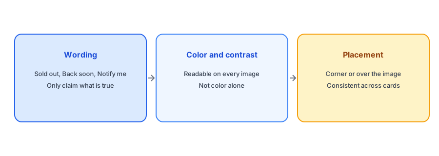
Wording: Honest and Useful
"Sold out" is clear and honest, and for many stores it is the right choice. You can adapt it when you know more. "Back soon" is friendlier, but only use it when you actually expect a restock, since it promises something. "Notify me" as a badge can turn a dead end into an invitation, if clicking the card leads to a page with a form. For items that will not return, "Sold out" is better than any hint of a comeback. Keep the wording short, since badges are small, and consistent across your store. Our post on what every sold-out page should show covers the page behind the badge.
Color and Contrast
A badge has to be readable on every product photo, from dark to bright. Pick a background color that contrasts with its text and, ideally, with typical images. Avoid relying on color alone to carry the message: the word on the badge is what matters, and some shoppers cannot tell colors apart. Muted grey badges look tidy but can disappear on busy images; a solid dark or light pill with strong text is easier to read. Check the result on a phone and on several products. Our accessibility checklist for the back-in-stock button covers contrast and other basics.
Let the badge say sold out and the page offer a way back. Griffin adds Notify Me to each sold-out variant and is free to start.
Install Griffin on ShopifyPlacement on Cards and Pages
Corner badges are common because they do not cover the product. Some themes also dim or grey the image of a sold-out product. Check that the badge does not hide an important part of the photo and that its position is the same on every card, so shoppers learn where to look. On the product page, make sure the unavailable state is also clear near the buy area, not only on the image. Our post on Notify Me on collection pages explains how the grid and the product page work together.
Variants: When Only Some Options Are Out
A badge on a product card usually reflects whether the whole product is unavailable, which is true only when every variant is sold out. If just one size is gone, a "Sold out" badge on the card would mislead. Most themes handle this correctly, but test it with a product that is sold out in one variant and available in others. Our post on why the button does not show unless every variant is sold out explains a related behavior.
Keep Changes Safe
Edit on a duplicate theme, compare, then publish. After any theme change, re-check your Notify Me button; see what breaks after a theme update. If the badge is generated by an app rather than the theme, its settings live in that app instead. And if you change wording, update any pages or emails that quote the old label, so customers see the same language everywhere.
A Practical Checklist
- Find the badge settings in the theme editor and the text in the theme's default content.
- Use honest wording; only say "Back soon" if you expect a restock.
- Check contrast on dark and light photos, on a phone as well as a desktop.
- Make sure the sold-out state is also clear on the product page.
- Test a product that is sold out in only one variant.
- Edit a duplicate theme first and re-test Notify Me afterwards.
FAQ
How do I change the sold-out text on Shopify?
Look in your theme's default content or language settings, since the label is usually a translatable string. Exact menus depend on the theme.
Should I use "Back soon" instead of "Sold out"?
Only if you expect a restock. A promise you cannot keep costs trust.
What color should the badge be?
One that contrasts with its text and stays readable on both dark and light photos. Do not rely on color alone.
Should the badge appear when only one size is sold out?
No. A product-level badge should show only when every variant is unavailable.
The Bottom Line
Make the badge honest, readable and consistent, and pair it with a page that offers a way back. Griffin is a Shopify back-in-stock app you can install from the Shopify App Store, free to start.