Most advice about restock alerts focuses on the product page, which makes sense because that is where the Notify Me form lives. But shoppers often meet a sold-out product earlier, in a collection grid or search results, where the card shows an image, a name and a price and maybe a small label. That first impression decides whether they click through, ignore the item or leave. Getting Notify Me right on collection pages is less about adding a button everywhere and more about being honest and making the next step obvious. This post covers the options, with caution about what your own app and theme can do.
What a Shopper Sees in the Grid
On a typical Shopify theme, a sold-out product in a collection shows a "Sold out" badge, and some themes grey out the image or hide the add-to-cart option. Some stores hide sold-out items from collections entirely. Each choice sends a different message. A clear badge tells the shopper the item exists and is unavailable. Hiding it removes the chance to capture interest, which is why we recommend against it for items that will return; our post on hiding out-of-stock products and SEO covers the search side.
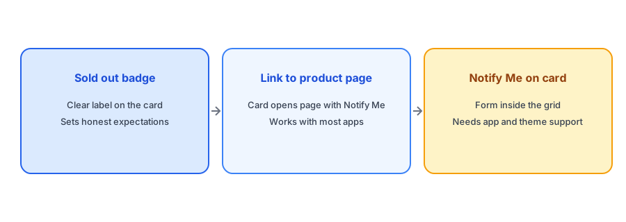
Option One: A Clear Sold Out Badge
Almost every theme can show one, and it should be easy to read on a phone. A badge sets an honest expectation and prevents the click that leads to disappointment. If you can add a short line such as "Back soon" only when you genuinely expect it, even better. Do not use language that implies a date you cannot keep.
Option Two: Let the Card Lead to a Page With Notify Me
This is the approach that works with nearly every app. The card links to the product page as usual, and the Notify Me form sits there. The shopper clicks, sees the form and signs up. To make it work well, ensure that sold-out products remain clickable from the grid and that the form is visible without scrolling on a phone. Our guide to adding a Notify Me button without code shows how to set it up, and popup versus inline placement explains how to test it.
Give every sold-out product page a Notify Me form. Griffin is free to start and takes minutes to add.
Install Griffin on ShopifyOption Three: Notify Me on the Card Itself
Some stores want the form directly in the grid so the shopper can sign up without leaving the page. It can raise signups for browsing traffic, but it is the hardest to do well. It depends on whether your app supports collection-level placement, whether your theme exposes the right spots on the product card and whether the form fits on a small card. Cards are small, and a form with fields crammed into them can look cluttered and hurt mobile layouts. Check your app's documentation before planning this, and test on a real phone. Do not assume any app offers it, and be prepared to use the simpler options if it does not.
Variants Add Complexity
A card represents a whole product, but sold-out status may apply to only some variants. A jacket can be sold out in one size and available in others. In that case, a "Sold out" badge on the card would be wrong, and a Notify Me form on the card would need to know which variant the shopper wants. This is why the product page, where the shopper chooses a variant, is the natural home for the form. Our post on why the button can disappear when a shopper switches variants covers a related pitfall.
Collections for Sold-Out Items
Another approach is to move sold-out items down the grid rather than hiding them, so shoppers see available products first without losing sight of the rest. Our guide to moving sold-out products to the end of your collections explains how to do it.
A Practical Checklist
- Show a clear, readable Sold out badge on cards for unavailable products.
- Keep sold-out cards clickable so they lead to a page with Notify Me.
- Move sold-out items lower in the grid rather than hiding them.
- Check your app and theme before planning a form on the card.
- Test the grid and the product page on a real phone.
- Only show "Back soon" language when you have grounds for it.
FAQ
Can I add a Notify Me button to collection pages?
It depends on your app and theme. Check the app's documentation, and if it is not supported, use a clear badge and let the card lead to a product page with the form.
Should I hide sold-out products from collections?
Usually not for products that will return. Hiding removes the chance to capture interest. Moving them lower in the grid is a better compromise.
What if only some variants are sold out?
The card should not say sold out. Let the shopper choose a variant on the product page, where the form can capture the right one.
What is the simplest setup that works?
A readable Sold out badge, cards that link to the product page and a visible Notify Me form there.
The Bottom Line
The grid is where sold-out items are first noticed. Be honest with a clear badge, keep the path to the Notify Me form short and only attempt a form on the card if your app and theme support it. Griffin is a Shopify back-in-stock app you can install from the Shopify App Store, free to start.