The words on a Notify Me button look like a small detail. In practice they carry the whole offer. A shopper has just learned that the thing they wanted is gone, and in a second or two they decide whether giving you an email address is worth it. Clear wording says what will happen and when, while vague or pushy wording sends people away. This post gives twenty-five ready-to-use examples across the moments that need copy, with notes on tone. We do not claim that any phrase converts better than another, because that depends on your audience, and the way to find out is to test. The example lines are suggestions to adapt, not proven winners, so change one thing at a time and compare signups over similar periods.
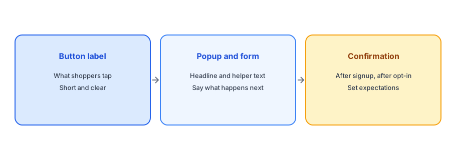
Button Labels
The label has to fit on a phone and say what the shopper gets. Seven options, from plain to warm:
- Notify me when available
- Email me when it is back
- Tell me when it is back in stock
- Get a restock alert
- Notify me when my size is back
- Join the restock list
- Let me know when it returns
If your form is variant-aware, the size version is useful because it tells the shopper the alert will be about their choice. Griffin ties each signup to the variant chosen, so the wording can say so.
Popup and Form Headlines
The headline reassures. Six options:
- Sold out for now. Want us to email you when it returns?
- We will email you the moment this is back
- Do not miss the restock
- Leave your email and we will do the watching
- Back soon? Be the first to know
- This one sold out. Get an alert when it is back
Follow the headline with one line of helper text, such as "One email, only about this item." That sentence answers the shopper's quiet worry about being added to a marketing list. It should only be used if it is true for your setup.
Pick your wording and publish it in minutes. Griffin adds Notify Me to sold-out products and is free to start.
Install Griffin on ShopifyConfirmation Messages
Right after signup, confirm what will happen. Six options:
- Thanks. We will email you when it is back.
- You are on the list. We will only email about this item.
- Done. Check your inbox to confirm your email address.
- Almost there. Confirm in the email we just sent.
- You are signed up for this size and color.
- All set. We will let you know as soon as it returns.
If double opt-in is on, as it is with Griffin, the confirmation must tell shoppers to check their inbox. Many will not, so make it prominent. Our guide to double opt-in and GDPR basics explains the trade-offs.
Opt-In Email and Restock Email Lines
For the confirmation email, keep the subject plain: "Please confirm your restock alert" and the opening line "Confirm your email so we can tell you when it returns." For the restock email itself, the subject examples in our list of subject lines apply, and the body can start with "Good news: the item you asked about is back." Four more lines to adapt:
- It is back. Quantities may be limited.
- Your size is available again.
- Here is the item you asked us about.
- You asked, we restocked. Take a look.
What to Avoid
Avoid fake urgency, such as "Hurry, only a few left" on a sold-out page, which makes no sense and erodes trust. Avoid promises you cannot keep, like "restocked next week" when you do not know. Avoid vague buttons such as "Submit", which do not say what happens. And avoid asking for more than an email unless you need it; see our guide to Notify Me form fields. For placement and testing on a phone, our post on popup versus inline placement helps.
Matching Tone to Your Brand
A luxury jeweler and a streetwear label should not sound alike on a button. Read your lines aloud against your product descriptions and your emails: if the button sounds like a different company, rewrite it. Playful brands can stretch to lines like "Tell me when it drops", while quieter brands do better with plain wording. Whatever you choose, keep it consistent across the button, the popup, the confirmation and the emails, so the shopper meets one voice from signup to restock. Consistency also helps the later emails feel expected rather than surprising.
A Practical Checklist
- Choose a button label that fits on a phone and says what the shopper gets.
- Add one line of helper text that says what you will and will not email about.
- Tell shoppers to check their inbox if double opt-in is on.
- Keep promises honest, with no invented dates or urgency.
- Test one wording change at a time and judge by signups.
FAQ
What should a Notify Me button say?
Something short that says what the shopper gets, such as "Email me when it is back".
Should I mention the size or color on the button?
If your alerts are variant-aware, yes. It tells the shopper the alert will be about their choice.
Should the form promise only one email?
Only if that is true for your setup. It reassures shoppers, but a false promise costs more trust than it earns.
How do I know which wording works best?
Test one change at a time and compare signup rates over similar periods.
The Bottom Line
Clear, honest words on a small button do a lot of work. Pick wording that says what happens next, and test it. Griffin is a Shopify back-in-stock app you can install from the Shopify App Store, free to start.